Author: admin

  • Caroline Shotton: Her career is MOOVIN’ along quite well!!

    Last month, we told you about her new Tour/Collection- “Moovin’” But we focused on her new products. Now I am going to show you another of her new pictures!


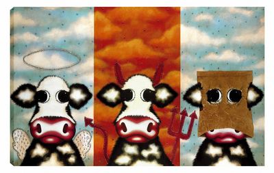
    “The Good, The Bad and The Ugly” by Caroline Shotton

    I read that Caroline Shotton was reluctant to create an “ugly” cow so thats why it has a paper bag over its head!!! I personally think it works well though. I also think the raindrops on the “ugly” side and the hearts on the “good” side look really amazing up close because from a distance it appears as though they are stick on gems, but up close you realise she has created this effect herself. Also, you cant tell from this picture, but the picture is hand embellished, from the paper bag to the red gems around the “bad” cow.

    The only thing with these cows are their sad little faces. Why must you make them so “long” in the face Caroline!?!

    Heres some fun links:

    Why do cows go moo? you will never guess according to this crazy website we discovered!!

    Fun cow facts

    Thanks,

    Vicki

  • Artist Bruno Tinucci – He likes rolling around in Tuscan fields!

    As a self-taught landscape artist, Tinucci found his own style of painting. His style has a touch of Livornese tradition as well as his personal style of using bright colours and bold brush strokes. He has a more traditional feel to his work which never goes out of fashion and can be described as classic and timeless.


    “La Bella Campagna” by Bruno Tinucci

    His works portray beautiful Tuscan countryside landscapes that you may expect to see on Italian sauce jars or wine bottles in the supermarket! Yes, his paintings show us that what we imagine the Tuscan countryside to look like is true.


    “Vista del Paese II” by Bruno Tinucci

    “People these days are interested in artistic pieces of great value and that is exactly what Bruno Tinucci’s paintings have achieved. However, not only does he keep tradition alive but he also expresses it with an up-to-date style that shows his greater understanding of contemporary art.” On Bruno Tinucci by Italian television art critic Mauro Innocenti in 1974 at an exhibition at “La Garda”, Milan.

    The new release “La Bella Campage” I especially like, for the way he has painted the flowers in the foreground with wisps of purple, red and yellow. I feel it is clever to have integrated this contemporary piece with traditional aspects.

    Livorno, Italy
    Milan, Italy

    Let us know your opinions of Bruno Tinucci’s work.

    Thanks

    Vicki

  • Paul Horton – ‘Love Is Life’ collection, New for Autumn 2009

    Often described as a unique storyteller, Paul Horton has recently released a new line of art work & within it you will see his trait for brightly coloured buildings, beside the seaside, continues!; as a mater of fact, released this time is a sculpture actually called ‘Beside the Sea’ which will bring a big smile to Horton fans.


    (Beside The Sea Sculpture by Paul Horton)

    His ingenious use of bright colours to create the weather-worn look to his seaside buildings captures the imaginations and fond memories of his fans who may remember family trips to the seaside as children.


    (Far Beyond Forever by Paul Horton)

    This piece depicts a couple standing in the foreground of a seaside street. At first glance, they may appear insignificant. However, they are looking out to sea with hopes and dreams for their future. Perhaps in this moment, they find all else insignificant?


    (Spellbound by Paul Horton)

    In this piece we see Gandalf is making potions at home. I love this picture because every time I look I see something new. There is also an owl in this picture. Possibly Hedwig from Harry Potter!! That’s probably why the cat looks so annoyed!


    (The Man Who No-One Knows by Paul Horton)

    Is he a sinister being? A man on his way home from work? Or is he a magician with a rabbit in his top hat? Who knows? That’s for you to decide! Let us know your thoughts!


    (Fragile Earth by Paul Horton)

    A very emotive piece depicting Noah’s Ark, of which Horton has previously painted in different situations. However, this piece is set in the North and South Poles to highlight the current issues of climate change. The Ark is shown to be there to rescue the animals from the melting ice caps.

    Thank you

    Vicki

    Links:
    British Seaside Resort of Cornwall
    British Seaside Resort of Blackpool
    BBC Climate Change News

  • Artist Henderson Cisz, New style & New look for Autumn 2009

    One of the UK’s top artists continues to show why he is ahead of the field by producing a series of limited edition pictures, Shadows of the city I, II & III, which is more diverse than any of his previous work.


    (Shadows Of The City II by Henderson Cisz)

    Inspired by the dazzling lights of big cities, Cisz’s latest limited edition box canvases: the ‘Shadows Of The City’ range displays the hustle and bustle of city life through his unique eyes. His new use of soft grey tones contrasted with black and white, beautifully portrays a busy evening in some famous cities. Cisz claims also to be inspired by the effect weather has upon an urban landscape, especially the rain! He says that the rain creates its own shadows and reflections, but also changes the way people move, as they hunch their shoulders and move more defensively.


    (Shadows Of The City I by Henderson Cisz)

    He has also subtly used some very limited red in the pieces, from street signs to a London bus in the background. I believe these gorgeous pictures are more technically advanced than any Cisz artwork I have seen before, certainly he is imaginative in his new use of these grey tones! A very fresh way to appreciate Henderson Cisz’s artistic talent.


    (Shadows Of The City III by Henderson Cisz)

    thank you

    Mark
    Links:

    More On landscape art
    List of famous Cityscape artists